

Although the containers were clearly labeled “do not use for food,” and the product was dyed orange-pink as an additional danger flag, sadly, seed grain treated with methylmercury fungicide still made it onto the dinner tables of thousands of people. The official death toll was 459, but figures at least ten times greater have been suggested, making it one of the greatest mercury tragedies of all time. Today, people are still living with the debilitating effects of the 1971 incident.
Although there were many contributing factors, a big one was a breakdown in international communication. Unbelievably, although the recipients of the grain were Arabic-speaking Iraqi farmers, warnings were printed only in English and Spanish.
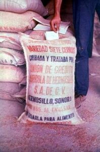
Sack of mercury-treated grain with Spanish writing. Source: Wikipedia
Events like this have pointed to the need for a universally understood hazard communication system. Although translation plays an important role, pictograms have the potential to convey basic hazard information to anyone, regardless of language. However, building a cohesive symbolic system that is universally understood is not as easy as it may seem. In this post, the Laboratory Safety Institute draws safety insights from the origin and development of common hazard pictograms.
From Egypt to GHS: Skull and Crossbones
Perhaps the easiest way to develop a new hazard symbol is to borrow from existing cultural imagery. The catch is, a symbol that is already in use usually comes with its own pre-attached meaning, which can lead to confusion. The skull and crossbones symbol is a classic example.
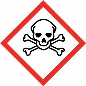
GHS standard pictogram: acute toxicity
When the United Nations adopted this symbol to mean "acute toxicity" as part of the Globally Harmonized System in 2003, it already had a long history tracing back to the Knights Templar in the 12th century and perhaps as far back as ancient Egypt. It has been used on everything from pirate ships to military uniforms to album covers. However, despite the obvious connection between skeletal remains and death, its use in hazard communication has, at times, misfired.
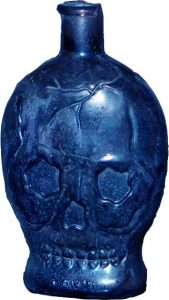
Skull-shaped poison bottle circa 1900
For example, beginning in the 1800s, as a safety feature for identifying bottles in the dark, glass bottles containing poison were formed in the shape of a skull. The practice continued until the 1920s when it was decided that the unique, colorful bottles were attractive to children and thus not helping the situation.
Pittsburgh Pirates logo, 1968-1986
History repeated itself in the early 1970s when health officials noted the rate of poison incidents involving children was much higher in Pittsburgh than the national average. Some officials believed that this was occurring, at least in part, because of the confusion caused by the logo of the Pittsburgh Pirates baseball team, which included a skull and crossbones.
Most tragically, some of the sacks of mercury-treated grain sold to Iraqi farmers did have skull on crossbones markings on them, but "this meant nothing to the Iraqi culture at the time," according to the book Diagnosis: Mercury: Money, Politics, and Poison by Jane Marie Hightower.
Clearly, even with a common symbol such as the skull and crossbones, one cannot assume the meaning will be automatically understood the same way everywhere. Using a symbol with pre-existing meanings requires people to unlearn previous conceptions and learn what the symbol means in the context of hazard communication.
Biohazard: The Most Meaningless Symbol Ever
Therefore, rather than draw on known symbolism, the makers of the biohazard symbol decided to go in the opposite direction, creating a symbol that had no pre-existing meaning in the minds of most people. “We wanted something that was memorable but meaningless, so we could educate people as to what it means,” explained Charles Baldwin, who helped create the symbol in 1966 at Dow.
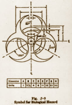
Design and proportion of the biohazard symbol. Source: Federal Register, 1974
To create a symbol as devoid of inherited meaning as possible, Dow's graphics team presented various symbols to a focus group and asked people to guess what each one meant. The design that received the fewest guesses was awarded 'most meaningless.' But marketing wanted a symbol that was not only meaningless, but also memorable, so they asked the same group a week later which symbol they remembered best. Focus groups picked the same symbol that had won in the 'meaningless' category, and the biohazard symbol was born.
The biohazard symbol is a true success story of hazard communication. Before it was developed, there was a clear need for standardization. United States Army labs used an inverted blue triangle for biohazards, while the Navy employed a pink rectangle. Meanwhile, Universal Postal Convention called for a white staff-and-snake design on a purple background. Other countries had their own dizzying array of conflicting symbols.
Soon after the symbol appeared in Baldwin's article in the journal Science, it was adopted by the Centers for Disease Control, the Occupational Safety and Health Administration and the National Institutes of Health. Today, it is recognized internationally and included in the UN Model Regulations for transportation signage. The biohazard symbol went from complete obscurity in 1966 to being one of the world's most recognized symbols in just a few decades.
Hazard Pictograms: New or Pre-Owned?
Whether borrowing a well-recognized symbol or inventing a new one, the challenge is getting worldwide acceptance and then educating people on the symbol's meaning and use. Perhaps the designers of the biohazard symbol were smart to start from scratch. That way, no one has to unlearn pre-existing meanings.
To learn more, sign up for the Laboratory Safety Institute's one-hour webinar: "Chemical Labeling and GHS." LSI members get a great deal on the entire year-long webinar series.